Select a category
The Service Design of Nest
There are many reasons to get a Nest thermostat. It’ll probably even pay for itself in a year or two, then start saving you money after that. Here’s the clincher though — the reason I evangelize the Nest wherever I go.
Yup. All kinds of old-school fugly.
Here is what I had immediately following the install of my Nest:
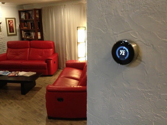
Here it is once I fixed the texture and painted:
Here were the features of my old thermostat:
Adjust-ish temperature of house from device
And that’s it.
Here are some of the features of the Nest thermostat:
Adjust temperature of house from device precisely
Adjust temperature of house from anywhere in the world
Program device to adjust temperature of house
Teach device to adjust temperature itself automatically
Detect when I’m home/away and adjust temperature accordingly
Just use the fans and turn off the heat/cool to conserve energy when possible
So those are just SOME of the features of the device itself. That feature-set is enough to convince many it’s a good buy. But there are a lot of thermostats out there that do that sort of thing (sort of). Why should you buy this one?
So, sure. It’s really cool looking. It’s got that nostalgic feel where you just rotate the outer ring to raise/lower the temperature. It’s got a nifty LCD screen with animated features that tell you all sorts of things. You can control it from your mobile device with a free app.
“Brandon!” you say. “What the heck is the point of this post already?”
OK — here it is.
These are all great reasons to buy and install the Nest thermostat. It’ll probably even pay for itself in a year or two, then start saving you money after that. Here’s the clincher though — the reason I evangelize the Nest wherever I go: It’s all of this, and more. The most important two words of this whole post: and more.
When you hear about the Nest for the first time it’s kind of silly — why is everyone getting psyched about a thermostat? Guess I’ll check it out. What’s the URL? nest.com — oh cool, that’s easy.
1 point Nest.
…and more…
Okay — I’m at nest.com, wow — gorgeous website; clean, simple, rich with details and animations.
10 more points Nest.
…and more…
Really helpful information, tutorials, testimonials etc.
5 more points Nest.
…and more…
But how do I know if it’ll work with my old and busted system? Oh — an online compatibility checker — sweet!
15 more points Nest.
…and more…
And that’s when I pre-ordered my Nest.
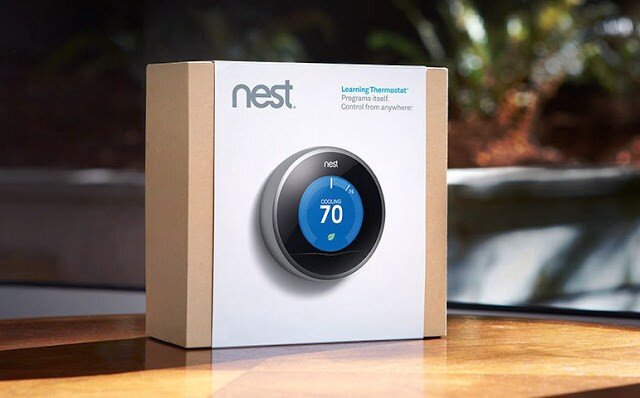
When you get the box in the mail — it’s beautifully packaged.
Here is a very detailed video I suggest watching that covers pretty much the whole 9 yards.
…and more…
As you unbox the Nest, even the attention paid to how and where the items are placed is impressive.
10 more points Nest.
…and more…
Just about every tool you might need is included.
5 more points Nest.
…and more…
The instruction manual is very clear, easy to understand and full of pictures.
5 more points Nest.
…and more…
The manual contains little stickers I can use to label my cables as I disassemble my old piece of junk so I can hook it up to the Nest correctly.
5 more points Nest.
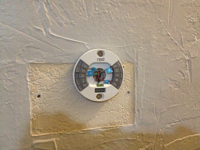
Here is what mine looked like at this stage in the process:
Note: It also comes with a cover plate that would’ve covered up that nasty wall without having to texture and paint, but I was going to do it anyway.
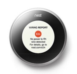
At this point, I’m just giddy with anticipation. All I have to do now is plug in the main device and we’re good to go. Oh, crap:
Crap crap crap. The first thing I see is an error. That’s not good.
-20 points Nest.
…and more…
What’s it say — There’s an error code — E24 and there’s a URL — nest.com/e24, so I go there. Oh, I probably just have a loose wire. I pull off the device, sure enough, exactly what they stated is what has happened. I reseat the wire and plug the device in — it works perfectly. The error was actually my fault, but the error reporting and ease of resolution have now made me a Nest fanboi. I’m actually GLAD I got the error so I could see how well they handled it.
+50 points Nest!
…and more…
It gets better. Now I install the iPhone app. I can’t even begin to tell you how cool it is. The stacked bar charts, the gamification of keeping my home green and warm all while saving money…it just goes on and on.
+100 points Nest.
…and more…
And now that everything’s installed, I hand the iPhone to my wife. She starts to play with it and falls in love with it after about 5 minutes. Her first experience with Nest was the iPhone app — and she’s just as big a fangirl now as I am. As I am a fanboi that is. Ahem…
+1000 points Nest.
Total: 1186 points Nest
Every day I discover new features on the hardware and the mobile app that continue to engage and satisfy.
This is Service Design
This is what service design looks like. It’s the magic recipe for success in your startup, design, party, endeavor — it doesn’t matter: always be ready with the ‘and more’ for your customer. When you can anticipate and pre-fulfill their needs at virtually every single step of the way like Nest has, you win. Each time a user interacts with your brand or product — that’s a touchpoint. Good service design ensures the user experiences ‘surprise and delight’ at each touchpoint, even if it’s an error or a support call.
At every step of the process from learning the nest.com URL until I handed the phone over to my wife, Nest surprised and delighted me. And more. Every single time I moved from one step to the next, I felt that Nest always had my back and had solved my problems before I even knew I had them. Imagine if every service, device, and software application we used went to such great pains — I think the world would be a much happier place, and more.
DISCLAIMER: I do not now, nor have I ever worked for Nest.
But they can reach me here!
Hey UI: Say what you mean, and mean what you Said
When Redbox first rushed their streaming service to market, they made a few missteps. My initial foray into using the service met with a few stumbles. I documented what I discovered, and a simple way the issues may have been avoided.
Anything to satisfy my wanton desire for massive amounts of media…
Around March of last year, I played around with Redbox Instant. There was a lot I thought they did well — namely, make it enough like Netflix that it’s easy for lots of people to start exploring, but different enough to be, well, different.
One of the things Redbox has going for it as a key differentiator is the they have kiosks everywhere. In fact, one of my favorite locations (at the time) in Coeur d’Alene, ID had 2 kiosks, and I could see a third one across the street.
So I’m a fan. That said, as with all things, there are some things I wish could be just a little more this or a little less that. Or just changed. Case-in-point:
circa March, 2013
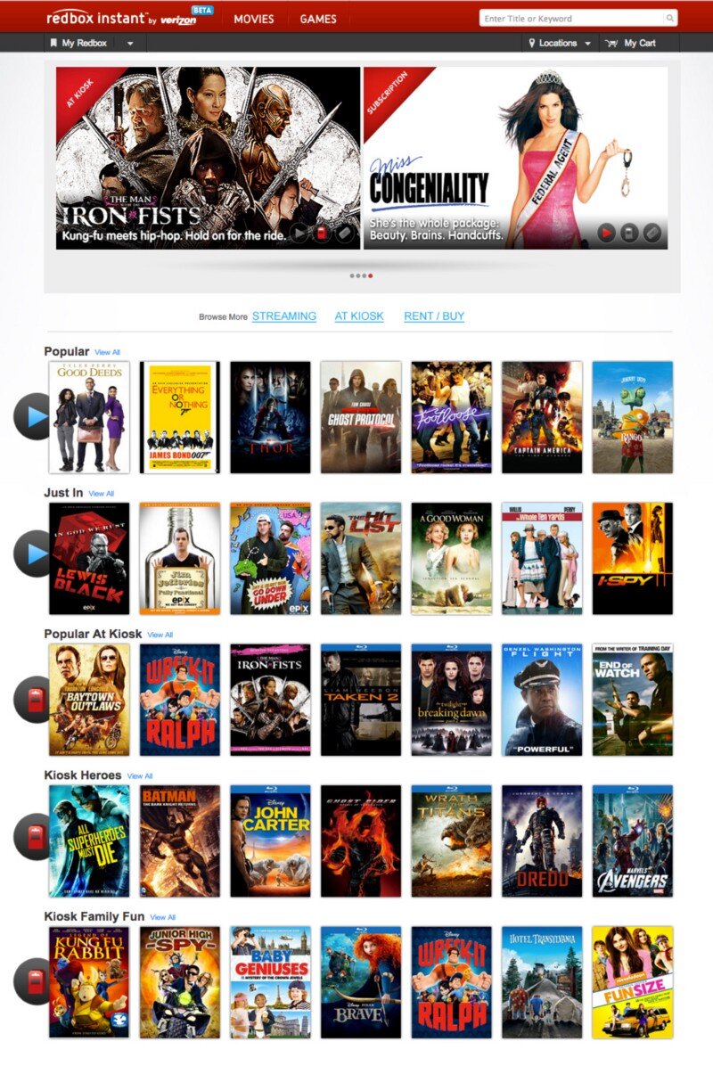
This is the screen I was greeted with when I visited redboxinstant.com (ca. March, 2013, now just redbox.com). With a quick scan, I saw there were some menu items, some featured movies, 3 grey buttons I’m not going to bother reading just yet, and then movies I can browse (not sure if that’s instant or kiosk or both yet). Then I saw there’s a search bar at the upper-right.
I scanned the carousel then below it to check out those 3 buttons since they looked important:
Subscription, At Kiosk, Rent / Buy.
Ok — so I can change my subscription features. Did I order a magazine? No, that’s probably the subscription to Redbox Instant. I can view what’s in the kiosks or I can rent and/or buy. Cool. But where do I see the streaming, instant movies?
I started scanning again — top-left corner:
“Redbox Instant” … hmm, okay. I didn’t accidentally go to redbox.com which is a totally different site altogether. This IS where the instant movies are. So that must be them there in the first row of browsable movies there. It must be the default.
I moused over Thor.
Yep. Big red ‘WATCH NOW’ button. These all seamed to be instant. Great. They got the defaults right. Thing is — why did I have to check? Why didn’t I just KNOW?
So I scrolled down to see what else they had.
Oh snap! They had Wreck-It Ralph, The Man With the Iron Fists, Taken 2, Flight and Dredd — all on instant! These had just dropped on DVD/Blu-Ray and were months from being released on Netflix. I thought
Props to Redbox — If they can keep up w/ releasing their streaming at the same time as their Kiosks Netflix has some serious catch-up to do! I’m gonna watch Taken 2.
So I hovered over Taken 2…
Wait — Blu-Ray? Must be a screenshot, I thought. Perhaps it means it’s a higher-quality stream ala Vudu’s HDX…
Hey — where did the Watch Now button go? I hovered over the rest — it was gone from all of them. Then I noticed the header, just above The Baytown Outlaws. Oooooh, Popular at Kiosk. Okay, so now I could see all of these were at the kiosk. Got it.
So initially, when I got to redboxinstant.com, I thought I was viewing streaming movies by default — otherwise, I’d have gone to redbox.com. So then I saw they’d started to merge their content — okay, I guess, eventually I suppose it’d all be merged at redbox.com. Fine. But right then, I wanted to watch an instant movie, got excited to see all the instant movies available, and ended up disappointed.
So in about 10 seconds, here’s the gamut of emotions I felt when I hit the home page:
Satisfaction (happy to have this service!)
Confusion (not sure what I’m looking at)
Understanding (I’m looking at instant movies)
Excitement (I’m gonna watch Taken 2 right now!)
Confusion (why can’t I watch it right now?)
Disappointment (oh — I’m viewing kiosk movies too)
Indifference (ah — I see they have trouble getting great streaming content quickly, just like Netflix)
Back to those 3 buttons…maybe there was something I missed. My stream of thoughts went something like this:
To their left I took the time to actually read the text I’d purposefully skipped earlier: “Browse More”. Browse More — Subscription. What the heck does that mean? I haven’t subscribed to anything, no magazines, no RSS feeds, no services…oh, redbox instant could be considered a service, is that what they mean by Subscription? If so, why isn’t it selected to show that I am, in fact, viewing instant, er, I mean subscription movies? I guess I’m viewing both, maybe? There is nothing to indicate what the list of movies I’m seeing is or where they can be found. I have to guess and check. My guessing and checking leads to understanding, excitement and ultimately confusion, disappointment and indifference. Now I have to click those 3 buttons to see exactly what they do. Oh — they take you to a set of pages that functions how I thought THIS page would function in the bloody first place.
Some very simple things can be done in about 15 minutes to save me, and thousands like me the 10 seconds of mental effort it took to get through all that and then generate a blog post:
Subscription? Really? Say Instant. Say Streaming. Say Online. Lots of other words to use. Subscription is just…wrong and means something else.
Indicate what the rows of movies below are.
Change the 3 buttons to something more indicative of page navigation links.
When you click on those buttons you actually navigate to another page entirely. The current style doesn’t make that very clear. So don’t make them look like a broken toggle/selected skin for an AJAX refresh, give me some other indicator that I’m viewing movies available for streaming AND at the kiosk.
Here are some simple ways we could address these issues:
I used the ‘Instant’ and ‘Kiosk’ icons already in use above in the featured movies (I didn’t even notice those until I started looking for how Redbox might have already differentiated instant from the kiosk). So they’ve already made the icons — just label each row what it’s full of and you’re good! This doesn’t affect the page size or layout at all and I think things are a lot clearer.
But even if you don’t do numbers 2 and 3, please Redbox, please, change the ‘Subscription’ to something that makes sense.


