Can Great UX Be Novel and Risky Too?
In my previous post Delivering Quality Experiences, there’s an overarching sentiment that introducing novelty and unique behaviors in your UX should generally be frowned upon. I still believe that (within the context of that article, largely focused on enterprise, software, web apps, and the like).
I’ve come to feel that we, the UX community, have been sacrificing experiential pleasure and meaning at the altar of usability and convenience.
But when it comes to the web, and digital media at large, I’ve come to feel that we, the UX community, have been sacrificing experiential pleasure and meaning at the altar of usability and convenience. At least, more than necessary. We have done, and continue to do so, to the detriment of our craft and the continued evolution of our collective digital experiences.
This is not to say that pleasure and meaning can only be derived from a novel, bold, or risky design or experience. But, take a look at the web around you and tell me when last you landed on a page or opened an app and felt enthralled. Giddy? Surprised? Excited? I cannot.
In writing this, I’m not saying anything that hasn’t already been said before. But this is the first time I’m saying it publicly, and wanting to do something about it.
What’s to blame?
Templates
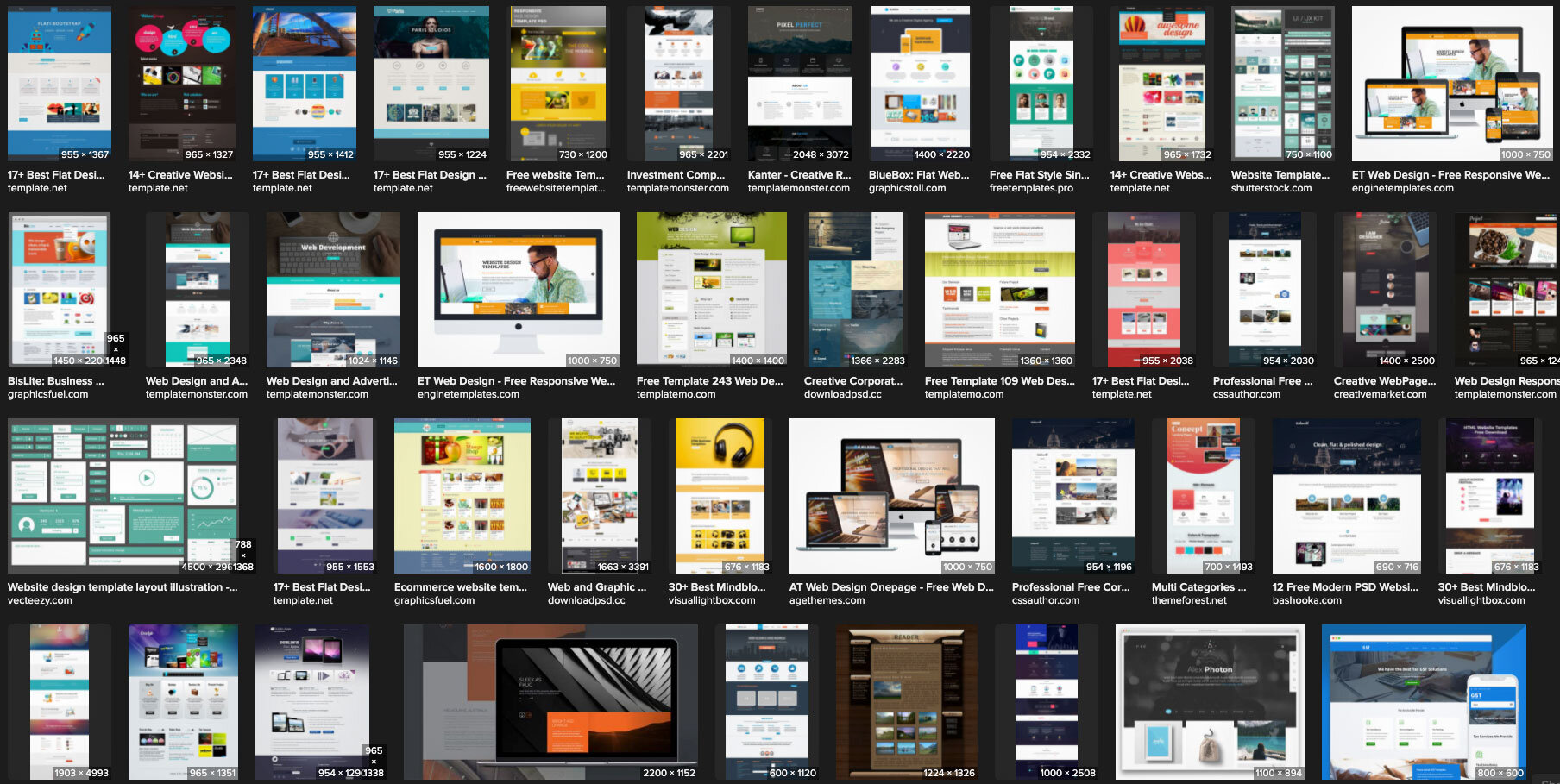
Design templates and libraries are easy, obvious targets. These alone literally make websites look and feel similar. Every time we reuse, repurpose, and revert to existing and common, we perpetuate the mundanity.
Grids
Grids are another culprit, but we’ve been designing cool stuff for thousands of years using grids (tile, mosaics, mandalas, buildings, etc.), so I say that’s a cop-out and not worth mentioning further.
Screens
Mobile and responsive breakpoints are yet another suspect. To me though, these should be thought of as opportunities for surprise and elegant delight. There’s no reason my mobile experience should have to function similarly or the same as the desktop experience, in fact, they really shouldn’t. Time and money are at play here though, and no amount of argument will change that. So suffice it to say that properly leveraged, device accommodation should be a motivator for exceptional and amazing design, not an excuse to get lazy.
Us
Mostly dear reader, the real answer is us. The UX community.
UX Design—the cause of, and solution to, all of the web’s problems
Specifically, ignorant UX is the cause of all the problems. I don’t mean ignorant UX designers or that UX is inherently ignorant. I mean UX design (and research, and testing et al) that ignores the top of the UX Hierarchy of Needs: Pleasure and Meaning. This ignorance relegates the majority of our output to what Stephen Andersen referred to as the Zone of Mediocrity. Is that where we want our designs and experiences to live? Or, would you rather take a little risk, actually design something new, even challenging for a change, and propel your product into a category all its own?
To those who would argue accessibility prevents them from taking risks, I call shenanigans. Making something work for people with different abilities doesn’t force you into a box. In fact, understanding those with various challenges to traditional interfaces may be exactly the boost your creative mind needs to try something daring and new! We know that mobile-first design can help solve a number of UX/UI issues by helping us make hard choices about how we architect information and lay out interfaces. Accessible-first design is the logical next and better step. When something works for everyone, it will work for anyone! Try it and watch your usability success rates skyrocket.
Yes. Great UX can also be novel and risky.
So next time we run through our processes and procedures, our research and readouts, our methods and our madness, let’s inject something new, something risky, something bold and outlandish. It might not work, and that’s okay. Fail early, fail often. But dare to fail. Could there be danger in the water where we can’t see the bottom? Sure, but it’s also where treasure sits awaiting discovery! I think the greater danger lies in the static banality of a ubiquitous internet where everything looks and feels like a slice of the same bland quiche.
Here’s to the designers who go beyond what and why, and start asking what if and why not!


