Select a category
Human-Centered, Robot-Driven: Ethical Considerations for ML in Design
ML in design has the potential to revolutionize the field, but it also raises ethical concerns. Learn about the issues with ML-generated content, bias, and theft and what steps we can take to protect artists and ensure accountability. #AI #ML #Design #Ethics
Cyborg face, generated by Midjourney
UPDATE 2.6.23—I’ve decided to correctly refer to these systems using their actual technologies (i.e. ML—Machine Learning) rather than the market-speak and false narrative of AI (Artificial Intelligence). The article has been updated accordingly.
Modern ML systems like ChatGPT and Midjourney changing how we design, and how we think about design today and in the future. This comes at a cost. If we’re not willing to play this game right we have no business playing it at all. Below I discuss some of the tools used today, some of the issues we’ve seen with these systems, and how we can work together to have our ML-generated cake and consume it too.
At the end of the article, I’ve listed just a few of these systems already in play today.
What are these ML thingamabobs anyway?
Thingamabob, generated by Midjourney
In a nutshell, systems like ChatGPT and Midjourney can generate human-like output (e.g. text and images respectively). Their models are trained on large amounts of existing data and can generate new, derivative content based on said data.
While these models have the potential to enhance the design process, they also raise several ethical, moral, and practical issues.
Bad actors
A shady character, generated by Midjourney
One of the main concerns with ML-generated content is the potential for the proliferation of propaganda and misleading information. These systems can also be used to impersonate real people and organizations, not only spreading falsehoods but also violating privacy with the potential to cause real harm. Additionally, it raises questions about the authenticity of any and all content, and the ability to trace it back to its original author.
Bias
Unbalanced, generated by Midjourney
Additionally, ML-generated content can perpetuate bias and discrimination. ML models are only as unbiased as the data they are trained on, and if the data is biased, the generated designs will also be biased. This could lead to designs that exclude or marginalize certain groups of people, which is a major ethical concern. A good example of this is using ML to recommend people for a promotion to management. Sounds brilliant right? Remove any notion of gender, race, physical attributes, or ability…perfectly objective yeah? Amazon discovered this isn’t so. Their system was trained on résumés of the people who’d historically done well in those positions in the large tech company. Care to guess which gender dominated at the tech giant? So even without the system being aware of gender, the bias was built into the training models simply because of how things worked in the past. Bias has found its way into our judicial system, mortgage lending, resident screening, and more affecting real people’s lives—and generally not for the better.
Theft
Man in black stealing art, generated by Midjourney
Some artists have gone so far as to launch a lawsuit against some of the ML generators like Stability AI and Midjourney. They claim their rights were infringed upon by having their work (and likely millions of others) scraped illegally by these companies to train their models.
Without the billions of pieces of work generated by these artists, the models would not be able to function and there would be no tool, but not a single artist has been attributed let alone compensated for the billions of hours taken to produce the original work.
Recognizing the problems
In "Weapons of Math Destruction", Cathy O'Neil describes three checks to identify "Weapons of Math Destruction" (WMDs) which are any systems, technologies, or models used in harmful ways, often to marginalized groups. The three checks are:
Opacity: A WMD is opaque if it is hard to understand how it works, and if its creators are unwilling or unable to explain it. This makes it difficult for people to question, investigate, or validate the model's assumptions, biases, or decisions.
Scale: The more people the tool has access to, and the more it's used, (the bigger the scale) the bigger the risk of the tool harming large groups of people.
Damage: A WMD causes damage if it’s used to make decisions with a negative impact on people's lives and if the people who are most affected by the model are not the ones who are best positioned to understand or challenge it. This makes it difficult for people to fight back against the model's decisions or to change the model itself.
Sara Wachter-Boettcher's "Technically Wrong" also highlights the importance of considering the ethical, moral, and societal implications of technology.
One of the key points they both make is the importance of using diverse and unbiased data sets when training ML models to reduce the potential for bias and discrimination in ML-generated designs. They both emphasize the importance of transparency and accountability when using ML, by being transparent about the technologies being used, and by monitoring and evaluating the ML-generated content to ensure they’re inclusive, unbiased, and not harmful.
O'Neil's WMD model highlights the importance of addressing the root causes of bias, such as the use of biased data sets, and the lack of diversity in tech companies. Wachter-Boettcher emphasizes the importance of designing technology with a human-centered approach, considering the potential consequences and impact on society when using technology, and the need to be transparent and accountable for the products they create.
What can we do?
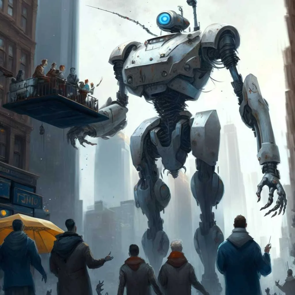
Robot and Human Handshake”, generated by Midjourney
Much like the monstrosity that is the image above, humans and machines alike have a lot of work to do to ensure we don’t make a giant mess of everything. Several actions can be taken today when leveraging ML in our work to avoid ethical, moral, and practical problems.
If you’re a data scientist or leader:
Use diverse and unbiased data sets: When training ML models, use diverse and unbiased data sets. This will help to reduce the potential for bias. This. Must. Be. Done.
Consider the social and ethical implications: Consider any potential consequences and impact when building generative systems. Ask yourself how a bad actor might use this for nefarious purposes.
Encourage ethical guidelines for ML usage: Work with industry groups and organizations to establish ethical guidelines for the use of ML.
If you’re a designer:
Be transparent about the use of ML: Clearly disclose when ML is being used in your process and the specific ML technologies being used. This will help to promote transparency and accountability.
Continuously monitor and evaluate generated content: Regularly monitor and evaluate the generated content to ensure they are inclusive, unbiased, and not harmful.
Consult with experts: Seek advice from experts in ML ethics, privacy, and legal issues when implementing ML in design work.
Invest in your education and professional development: Stay current on the latest developments and best practices in ML-based design to stay informed about the ethical and practical issues surrounding ML-based design.
Elevate artists and designers, don’t exploit them
Bots lift us up where we belong, generated by Midjourney
Implement clear attribution and copyright policies: Clearly state how ML-generated content will be attributed and ensure that the original creator is credited for their work.
Use ML to augment, not replace, human creativity: ML should be used to assist designers in the creative process, not replace them. This will ensure human creativity and artistic expression are still valued, and keep humans centric in the process.
Educate artists and creators about ML: Educate artists and creators about the capabilities and limitations of ML so they can make informed decisions about how they want to use it in their work.
Encourage collaboration between artists and ML experts: Encourage collaboration between artists and ML experts to ensure that ML is used in a way that supports and enhances the artist's vision.
Encourage Fair Use and Open-source policies: Encourage the usage of open-source ML technologies to ensure accessibility and fairness. Transparency into the algorithms will help prevent them from being maliciously used.
Protect intellectual property and provide compensation: Provide artists and creators with attribution and compensation for the use of their work in training models.
ML has the potential to enhance the design process, but it raises several ethical, moral, and practical issues. It’s paramount that everyone, designers, developers, leaders, and end-users alike, is aware of these issues and actively takes steps to mitigate them. This includes being transparent about how the ML models work, being accountable for the generated content, and being aware of and addressing bias in the data and generated content. Additionally, it's important to consider how ML-generated content may impact artists and creators and to work towards fair compensation and attribution for their work. By taking these steps, we can ensure ML is used responsibly and ethically, while still reaping the benefits of this powerful technology.
Sidenote: Not for nothing, the courts are literally still out on who exactly owns the output from generative systems. While OpenAI’s terms seem to indicate users own their output, the law is a lot more divided at the moment in terms of actual copyright.
And finally, it’s up to the technologists to take a bigger role in policing ourselves, and asking whether something should be done as often as we ask if it can be done, as well as how we do it.
Author’s note: This article was written with the assistance of ChatGPT and has a GPTZero score of 268.4: “text is likely human-generated”.
Some existing ML design and content systems:
GPT-3 (Generative Pre-trained Transformer 3): A language model developed by OpenAI, it can be used for NLP (natural language processing) tasks such as text generation, language translation, and language understanding.
Autodesk Dreamcatcher: A generative design tool that uses algorithms to generate design solutions based on design constraints and goals. It allows designers to explore a wide range of design possibilities, leading to more innovative and unique solutions.
Microsoft Sketch2Code: An ML-powered design tool that can turn a hand-drawn wireframe into a functional website. It uses ML (machine learning) to understand the design and automatically generate the corresponding code.
Midjourney: An ML-based generative design tool that can generate images and videos based on input like text prompts, or other images or videos. It's used to generate new and unique designs and art.
Can Great UX Be Novel and Risky Too?
I’ve come to feel that we, the UX community, have been sacrificing experiential pleasure and meaning at the altar of usability and convenience. We have done, and continue to do so, to the detriment of our craft and the continued evolution of our collective digital experiences.
In my previous post Delivering Quality Experiences, there’s an overarching sentiment that introducing novelty and unique behaviors in your UX should generally be frowned upon. I still believe that (within the context of that article, largely focused on enterprise, software, web apps, and the like).
I’ve come to feel that we, the UX community, have been sacrificing experiential pleasure and meaning at the altar of usability and convenience.
But when it comes to the web, and digital media at large, I’ve come to feel that we, the UX community, have been sacrificing experiential pleasure and meaning at the altar of usability and convenience. At least, more than necessary. We have done, and continue to do so, to the detriment of our craft and the continued evolution of our collective digital experiences.
This is not to say that pleasure and meaning can only be derived from a novel, bold, or risky design or experience. But, take a look at the web around you and tell me when last you landed on a page or opened an app and felt enthralled. Giddy? Surprised? Excited? I cannot.
In writing this, I’m not saying anything that hasn’t already been said before. But this is the first time I’m saying it publicly, and wanting to do something about it.
What’s to blame?
Templates
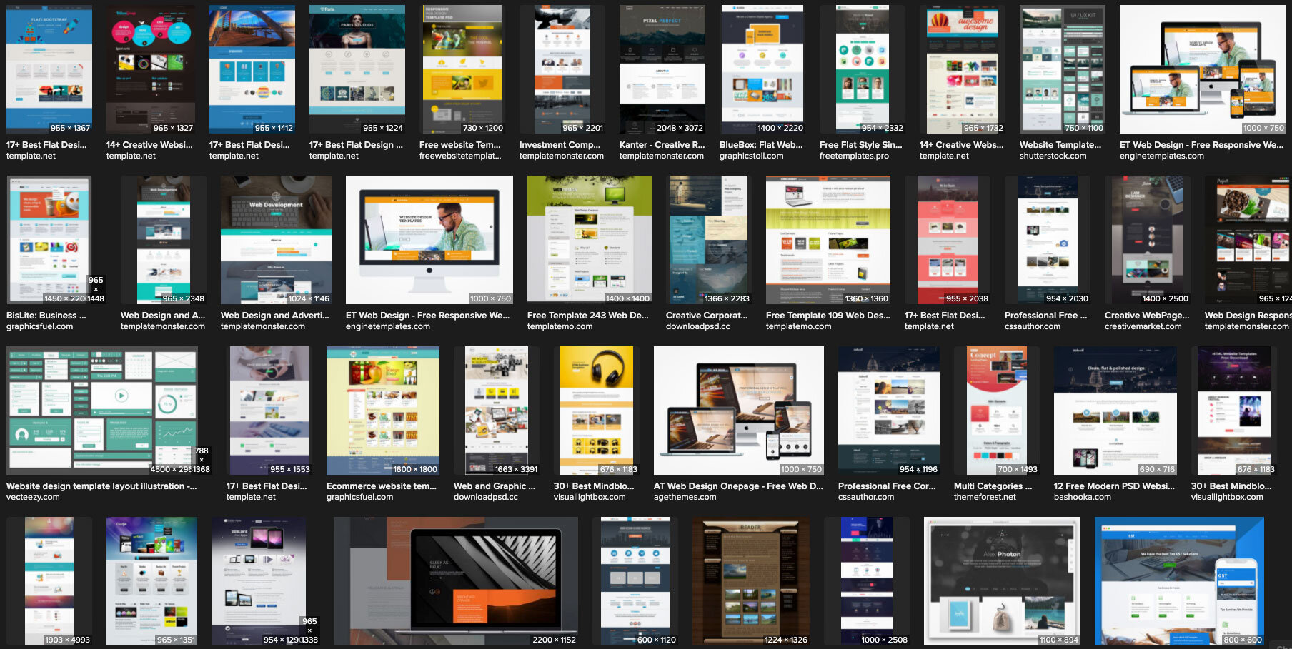
Design templates and libraries are easy, obvious targets. These alone literally make websites look and feel similar. Every time we reuse, repurpose, and revert to existing and common, we perpetuate the mundanity.
Grids
Grids are another culprit, but we’ve been designing cool stuff for thousands of years using grids (tile, mosaics, mandalas, buildings, etc.), so I say that’s a cop-out and not worth mentioning further.
Screens
Mobile and responsive breakpoints are yet another suspect. To me though, these should be thought of as opportunities for surprise and elegant delight. There’s no reason my mobile experience should have to function similarly or the same as the desktop experience, in fact, they really shouldn’t. Time and money are at play here though, and no amount of argument will change that. So suffice it to say that properly leveraged, device accommodation should be a motivator for exceptional and amazing design, not an excuse to get lazy.
Us
Mostly dear reader, the real answer is us. The UX community.
UX Design—the cause of, and solution to, all of the web’s problems
Specifically, ignorant UX is the cause of all the problems. I don’t mean ignorant UX designers or that UX is inherently ignorant. I mean UX design (and research, and testing et al) that ignores the top of the UX Hierarchy of Needs: Pleasure and Meaning. This ignorance relegates the majority of our output to what Stephen Andersen referred to as the Zone of Mediocrity. Is that where we want our designs and experiences to live? Or, would you rather take a little risk, actually design something new, even challenging for a change, and propel your product into a category all its own?
To those who would argue accessibility prevents them from taking risks, I call shenanigans. Making something work for people with different abilities doesn’t force you into a box. In fact, understanding those with various challenges to traditional interfaces may be exactly the boost your creative mind needs to try something daring and new! We know that mobile-first design can help solve a number of UX/UI issues by helping us make hard choices about how we architect information and lay out interfaces. Accessible-first design is the logical next and better step. When something works for everyone, it will work for anyone! Try it and watch your usability success rates skyrocket.
Yes. Great UX can also be novel and risky.
So next time we run through our processes and procedures, our research and readouts, our methods and our madness, let’s inject something new, something risky, something bold and outlandish. It might not work, and that’s okay. Fail early, fail often. But dare to fail. Could there be danger in the water where we can’t see the bottom? Sure, but it’s also where treasure sits awaiting discovery! I think the greater danger lies in the static banality of a ubiquitous internet where everything looks and feels like a slice of the same bland quiche.
Here’s to the designers who go beyond what and why, and start asking what if and why not!
Delivering Quality Experiences
Effective UX has to walk the line between fresh and novel, and usable. Novel is interesting initially, but usable has to be useful when the shimmer has worn off. We strive to achieve both of those valuable experiences.
Photo by Michaela Baum on Unsplash
1. The Basic Design Process
The Brief
We've all seen the cliché memes even if we haven't experienced them ourselves:
Make the logo bigger! Make it pop! Add more sizzle! Make it fresh! Wow me!
And, honestly, we've also seen some sites that do just that, some even do it well. Everything from auto-playing music and sound effects, to parallax, animated gradients, interactive video, even websites that are almost full-blown video games in their own right.
It can feel as if every call with the client begins in a similar vein.
"We're building <APP> for <VERTICAL>. It's like <OTHER APP>, but ours will be different because <POP/SIZZLE/GAMIFICATION>."
We nod our heads. "It'll have dynamic, user-content-driven dashboards!" Yep. "And we want it to work on mobile and tablets." Absolutely. "It'd be cool if we could have some ML and AR involved there too, but we're not sure how yet. We're hoping you can help us figure that part out." Nothing new here. You want it to be accessible too right? “Oh yeah, accessibility! If we have time left, do that!” <sigh>
Research
You do your research. You talk to the stakeholders. You ask hundreds of questions of your client's customers. You unravel the knot of unknowns, and patterns of user behavior emerge. You begin to understand what the business actually needs, and what the users actually need. You rough out an IA and test it. You see the pitfalls in the current journey. You identify inefficiencies and problems, er, opportunities across the service layers. You present your findings. "Yes! You get it!" the client says. We're all on the same page. You understand the problem, and you begin solving it.
UX Design
You wireframe. You prototype. You assure the client that, no, these aren't the actual colors. No, that's not English it's called Greeked text. “Why does it look like Latin if it's called Greeked text? Why don't the numbers in those columns add up?” So you replace all the lorem ipsum with real-ish copy and adjust the numbers to make a little sense. Okay, now they get it. No, that's likely not the font you'll use, we're just trying to get a sense of how things work first. Visual design will come later. Okay, they get it. Sort of. So, you begin testing.
Photo by Amélie Mourichon on Unsplash
Testing
Testing goes great. You uncover some problems with the IA. No biggie, super-easy change. You see some small issues with some labels, so you wordsmith those. There are a couple of show-stoppers that make you feel stupid. How did you not see that before!? But you see it now, and you've already got 2 or 3 ideas for how to solve that. Things are smokin! You report your results. It tested through the roof, and you're very confident users will experience very little friction. They'll be able to easily grasp the tasks with no supervision. You've organized things with clear paths. Sequential work is laid out so it's obvious what came before, what they're doing now, and what comes next. The client begins to see how amazing this new vision is. So you move on to visuals.
Photo by UX Indonesia on Unsplash
Visual UI Design
The visual designers kill it. Maybe it's another team. Maybe it's you. Maybe it's Maybelline. They've transformed your usable, utilitarian, efficiency-driven low-fi wires into gorgeous, pixel-perfect renderings of the final vision.
And here's where things can get dicey.
Photo by Daniel Korpai on Unsplash
2. The Road To Destruction
Make it Pop!
"I like it..." says the HiPPO. "...but I don't love it." This is nothing new. We're designers, and this is the path we've chosen. Okay, that's fair. What don't you love about it?
"Oh, I don't know. It just doesn't pop/wow/sizzle/whatever. Have you been to <THAT HOT VIDEO GAMESITE>? They've got lasers, and real-time AR video that places you right in the middle of the screen and when you move your mouse around your little guy runs after it! And when you scroll, it scrolls horizontally, not vertically, which gives it a panoramic feeling! It's really cool!"
Everyone is forcing smiles and nodding...
"I know our accounting platform isn't a video game, but why can't we do something cool like make the avatars move around, or use their webcams to show a real-time view of their face so they don't have to upload a photo? What if when they scrolled, the data grid used that cool parallax motion so the columns moved underneath one another like those cool Miyazaki films? Anyway, all our competitors scroll vertically...what if we laid all our stuff out horizontally? It'd really set us apart!"
Okay - so I may be exaggerating some client requests and expectations, but honestly, not by very much.
The infamous LingsCars.com
Note: I don’t hate Lingscars.com for a number of reasons. Perhaps that’s another article.
Also, I’m not talking about getting the right feedback at the right time. That’s a different issue, nicely addressed in this article by James Cook.
3. The Path To Quality
The Truth
It’s times like these my boss Tim is wont to say
“Effective UX has to walk the line between fresh and novel, and usable. Novel is interesting initially, but usable has to be useful when the shimmer has worn off. We strive to achieve both of those valuable experiences.”
The first thing about introducing anything "fresh and novel" is that you've created your own usability debt. By its very nature, the user is being introduced to something they may not be familiar with and will have to discover and learn. If this is a game, or a marketing site, maybe that's a great thing. If it's accounting software, it's not. In fact, in most (if not all) cases I'd argue introducing your own obstacles to clarity and efficiency, not managing to your user base's existing mental models is bad. It’s like tying your own shoelaces together then trying to sprint.
Remember Stephen Anderson's hierarchy of UX?
Concept and design by Stephen P. Anderson
We assume the app will be built to function reliably. Our job is to make it first usable and convenient. Only when we've established that base platform can we even begin to explore pleasure and meaning. If you try to design for uniqueness and stand-out visuals prematurely, you'll compromise your own foundation that your research and design teams spent so much time and effort establishing.
Does this mean we don't try to cross the chasm of convenience and push our apps into the pleasure zone? No. In fact, apps like Word and Excel could really use a healthy dose of pleasure and meaning, and dare I say convenience as well. But managing design and experience at this level gets exponentially harder. Your baseline reliable functionality that's relatively usable is table-steaks. It absolutely has to do that or nobody will use it at all. But if you don't even try to shoot for some novelty, some fresh expression, they may use it a bit, but have no desire to come back. This is one of the biggest problems with MVPs (minimum VIABLE products). When was the last time you really enjoyed an experience or app or site and said to yourself, "Wow, that was a really viable experience!"?
The Product Roadmap
This is why we choose to design and build Minimum VALUABLE Products (I'd also have accepted Minimum Lovable Products). Because MVP is so common though, we don't even use that acronym. We use Cupcake, Birthday Cake, and Wedding Cake.
Cupcake (your minimum valuable product) is what absolutely must ship, otherwise, there's no point. It's important to note here that Cupcake isn't a horizontal cut of the hierarchy though, sacrificing convenience, pleasure, and meaning for a baseline product that merely satisfies at an intellectual level. No, Cupcake products cut vertically up the pyramid, capturing a bit from every layer.
The cake analogy is so powerful, because at their core, all three types of cake are the same. You've got flour, eggs, sugar, cocoa, icing, maybe even a creamy filling and a topper. A bite of a cupcake and a wedding cake are essentially the same experience, just in a less substantial form.
Cupcake offers a compelling experience
Birthday Cake enhances that experience
Wedding Cake is the full realization of the product vision
Cupcake encompasses the things you KNOW you must deliver to provide real value.
Once that core value is delivered, you can begin on some Birthday Cake revisions, adding additional features, functions, dare I say, even sizzle, insomuch as they enhance the core experience of your app. You scale. You are able to handle more clients. But when you're building Cupcake, as much as you want that slick new feature or novel AR avatar experience, you have to justify that it's part of the core foundational experience and nobody would bother with your app without it, or, if it's an enhancement that can build onto the base in a fast-follow release (Birthday Cake). Wedding cakes are the "big show" of cakes.
Wedding Cake is what you envision your product to be two to five years from now, with all the bells and whistles that make Wedding Cakes so much more substantial than your humble cupcake. But all the while, you're really providing the core value in your initial cupcake offering, and getting hung up on fresh trends and unique, fun, and sizzling design can detract, and more often, even degrade, even break your core experience.
Have Your Cake & Eat It Too
To wit:
The Basic Design Process
The Brief—Effective planning and setting expectations
Research—Discover insights into the problems you’re solving
UX Design—Design like you know you’re right
Testing—Test like you know you’re wrong
Visual UI Design—Enhance the experience with brand guides and style
The Road To Destruction
Make it Pop!—Here be monsters
The Path To Quality
The Truth—Keep it real, make sure you stay focused on what matters
The Product Roadmap—Cupcakes! Delicious, moist cupcakes!
Let's seek to build Cupcakes that span the layer-cake hierarchy from functional, to reliable, to usable, past the chasm of convenience, even to pleasure and meaning.
Once we've designed the thing the users actually need that supports the business' goals, don't let sparkle get in the way of delivering a great, valuable product.
Empathy In Your (inter)Face
In The Media Equation Reeves & Nass find that people interact and respond emotionally to computers pretty much the same way we interact and respond to other humans.

In The Media Equation Reeves & Nass find that people interact and respond emotionally to computers pretty much the same way we interact and respond to other humans. Stephen P. Anderson illustrates pretty much the same thing in his book Seductive Interaction Design:
We identify with (or avoid) certain personalities
Trust is related to personality
Perception & expectations are linked with personality
Consumers choose products that are an extension of themselves
We treat sufficiently advanced technology as though it were human
If the interface is cold, heartless, and unforgiving, we respond to it emotionally the same way we would if we were interacting with a cold, heartless, unforgiving person.
Here are some examples of some notifications that something went wrong. Which do you prefer?
While perhaps technically accurate and helpful to a programmer, the first error is pretty much useless to the regular user, who is left to wonder in dismay at what just happened and what it means to the action they were performing.
This explains in very human-readable terms what probably just happened, what the error code is (for those who might care), and some possible solutions (retype the URL, send them an email).
Here’s another way to look at it
You’re shopping for a spice called Garam Masala. You know what it is (if you don’t, try some!), but many don’t. You walk into the store and ask to be directed to the spices. You spend a few minutes searching but just aren’t able to find any garam masala — so you ask an employee for some assistance.
You: “Pardon me — do you know if you carry garam masala, and if so, where I could find it?”
Employee: “No.”
You: “No? No you don’t carry it or No you don’t know where it is.”
Employee: “Yeah.”
You: “Ummmm…okay.”
vs.
You: “Pardon me — do you know if you carry garam masala, and if so, where I could find it?”
Employee: “Hmmm…I’ve never heard of it. How’s it spelled? Let’s see if we can find it.”
…employee helps you look…
Employee: “I’m sorry — if we do carry it, it doesn’t appear to be in stock. I’ll ask my supervisor about it. Is there a way I can reach you to let you know what I find out? Meanwhile, you might try <Super Spice Store> — they tend to carry a really large variety of spices and you’ll probably find it there.”
You: “Sure — thanks!”
Which scenario would make you feel more at ease? In which scenario are you more likely to return to that store again even though they weren’t able to help you out this time? Which scenario is more like interacting with a heartless, non-empathetic machine?
One example of this that has always bothered me is the PoS system (aptly named) at the grocery store. You slide your card and type in your PIN. When the cashier has finished ringing everything up (if, in fact, you didn’t slide it too early and have to do the whole process all over again) you’re presented with something akin to this:
Total: $123.35
Is this amount okay?
[ YES ] [ NO ]
And every time I want to hit the [ NO ] button. What if I feel that this amount is too costly? What if I really only want to spend $95 instead of $123? Heck, what if I want to pay more? Most of the time, if I’m honest with myself, and the machine, I must hit the [ NO ] button. I can’t though, because I know that’ll probably void the transaction, which is why I’m here in the first place. So, I’m forced to answer ‘yes’ to a question that I adamantly believe should be answered ‘no.’ The machine made me lie, and now I’m not only unhappy about the cost, I’m unhappy about the experience.
What if you at least corrected the English in the question, and instead you were presented with this:
Total: $123.35
Is this the correct amount?
[ YES ] [ NO ]
This is actually what the system is asking for. Now I’m not being asked to lie — but now the computer, whose job it is to add things up since the abacus, is asking ME to do its job for it — add up all the values, calculate sales tax, etc. This doesn’t breed confidence in the system. I could guess, by we pretty much trust the machines to know these things. So now I’m not sure — did everything get rung up correctly? Did my sale items register at sales prices? I don’t know if it’s really correct. Is there an “I don’t know” button? Nope. This message still lacks and I’m forced into answering something I’m not comfortable with.
I LOVE the convenience technology affords us, but it’s not justification to substitute an impersonal experience for a cold, heartless one. We can have convenient tech and warm-n-fuzzy mom-and-pop-shop-style interactions too!
Cause I’ve got an idea!
What if it went down like this…
You’ve swiped your debit card. The system knows who you are now (your customer rewards card is linked to your debit card) and pulls up your recent purchase history etc.
Hey Brandon! Your total today is:
$123.35
Is this amount okay?
[ Sure ] [ Not Really ]
You’re not really feeling the total today, so you click [ Not Really ]
I’m sorry about that. How about this total?
Total: $115.00
Is this amount okay?
[ Sure ] [ Not Really ]
Hey — that’s cool. It just gave you an $8.35 discount! Maybe it’s still too high, and heck, it won’t hurt to try again…you click [ Not Really ].
Dang — I’m really sorry. That’s the best I can do today Brandon.
Total: $115.00
Would you like to continue with your purchase, or come back another time?
[ Continue ] [ Come Back Later ]
Now you’re feeling like you were able to get a deal and have a positive interaction with the (more humane) system. You click [ Continue ].
Thanks for your purchase, Brandon. I’m printing out some relevant coupons that might help you save a bit more next time.
Heck, even if you clicked [ Not Really ] and it straight up said the first time “sorry dude, no deals this time” you’d feel like you’d at least tried and the machine empathized with your lack of desire to part with your money.
You see, as in life, even when the answer is NO, when executed well and empathetically, you can foster good-will and trust with your customer/user which will encourage repeat business. It’s not hard — just inject some personality into those dialog boxes and copy. Breathe some life into those warnings, errors, and success messages. After all, it’s not really the computer we’re interacting with, but the designers and programmers that brought the system into the world.
So all you supermarkets and convenience stores out there with your fancy PoS machines and rewards cards — build me something cool and empathetic that might potentially throw me a bone now and again with some relevant coupons or an immediate savings of a few bucks just to let me know you value me as a customer and understand what my needs and desires are. That would make me RAVE about you to my friends and family and return again and again in the hopes that maybe this time I’ll get the response:
“Hey Brandon, you’ve been a loyal customer over the past few months, so today, your milk is on the house. Have a great day!”
The Service Design of Nest
There are many reasons to get a Nest thermostat. It’ll probably even pay for itself in a year or two, then start saving you money after that. Here’s the clincher though — the reason I evangelize the Nest wherever I go.
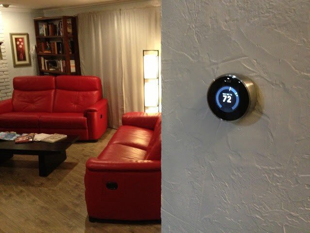
Yup. All kinds of old-school fugly.
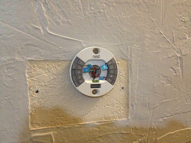
Here is what I had immediately following the install of my Nest:
Here it is once I fixed the texture and painted:
Here were the features of my old thermostat:
Adjust-ish temperature of house from device
And that’s it.
Here are some of the features of the Nest thermostat:
Adjust temperature of house from device precisely
Adjust temperature of house from anywhere in the world
Program device to adjust temperature of house
Teach device to adjust temperature itself automatically
Detect when I’m home/away and adjust temperature accordingly
Just use the fans and turn off the heat/cool to conserve energy when possible
So those are just SOME of the features of the device itself. That feature-set is enough to convince many it’s a good buy. But there are a lot of thermostats out there that do that sort of thing (sort of). Why should you buy this one?
So, sure. It’s really cool looking. It’s got that nostalgic feel where you just rotate the outer ring to raise/lower the temperature. It’s got a nifty LCD screen with animated features that tell you all sorts of things. You can control it from your mobile device with a free app.
“Brandon!” you say. “What the heck is the point of this post already?”
OK — here it is.
These are all great reasons to buy and install the Nest thermostat. It’ll probably even pay for itself in a year or two, then start saving you money after that. Here’s the clincher though — the reason I evangelize the Nest wherever I go: It’s all of this, and more. The most important two words of this whole post: and more.
When you hear about the Nest for the first time it’s kind of silly — why is everyone getting psyched about a thermostat? Guess I’ll check it out. What’s the URL? nest.com — oh cool, that’s easy.
1 point Nest.
…and more…
Okay — I’m at nest.com, wow — gorgeous website; clean, simple, rich with details and animations.
10 more points Nest.
…and more…
Really helpful information, tutorials, testimonials etc.
5 more points Nest.
…and more…
But how do I know if it’ll work with my old and busted system? Oh — an online compatibility checker — sweet!
15 more points Nest.
…and more…
And that’s when I pre-ordered my Nest.
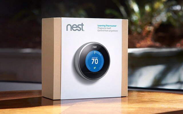
When you get the box in the mail — it’s beautifully packaged.
Here is a very detailed video I suggest watching that covers pretty much the whole 9 yards.
…and more…
As you unbox the Nest, even the attention paid to how and where the items are placed is impressive.
10 more points Nest.
…and more…
Just about every tool you might need is included.
5 more points Nest.
…and more…
The instruction manual is very clear, easy to understand and full of pictures.
5 more points Nest.
…and more…
The manual contains little stickers I can use to label my cables as I disassemble my old piece of junk so I can hook it up to the Nest correctly.
5 more points Nest.
Here is what mine looked like at this stage in the process:
Note: It also comes with a cover plate that would’ve covered up that nasty wall without having to texture and paint, but I was going to do it anyway.
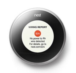
At this point, I’m just giddy with anticipation. All I have to do now is plug in the main device and we’re good to go. Oh, crap:
Crap crap crap. The first thing I see is an error. That’s not good.
-20 points Nest.
…and more…
What’s it say — There’s an error code — E24 and there’s a URL — nest.com/e24, so I go there. Oh, I probably just have a loose wire. I pull off the device, sure enough, exactly what they stated is what has happened. I reseat the wire and plug the device in — it works perfectly. The error was actually my fault, but the error reporting and ease of resolution have now made me a Nest fanboi. I’m actually GLAD I got the error so I could see how well they handled it.
+50 points Nest!
…and more…
It gets better. Now I install the iPhone app. I can’t even begin to tell you how cool it is. The stacked bar charts, the gamification of keeping my home green and warm all while saving money…it just goes on and on.
+100 points Nest.
…and more…
And now that everything’s installed, I hand the iPhone to my wife. She starts to play with it and falls in love with it after about 5 minutes. Her first experience with Nest was the iPhone app — and she’s just as big a fangirl now as I am. As I am a fanboi that is. Ahem…
+1000 points Nest.
Total: 1186 points Nest
Every day I discover new features on the hardware and the mobile app that continue to engage and satisfy.
This is Service Design
This is what service design looks like. It’s the magic recipe for success in your startup, design, party, endeavor — it doesn’t matter: always be ready with the ‘and more’ for your customer. When you can anticipate and pre-fulfill their needs at virtually every single step of the way like Nest has, you win. Each time a user interacts with your brand or product — that’s a touchpoint. Good service design ensures the user experiences ‘surprise and delight’ at each touchpoint, even if it’s an error or a support call.
At every step of the process from learning the nest.com URL until I handed the phone over to my wife, Nest surprised and delighted me. And more. Every single time I moved from one step to the next, I felt that Nest always had my back and had solved my problems before I even knew I had them. Imagine if every service, device, and software application we used went to such great pains — I think the world would be a much happier place, and more.
DISCLAIMER: I do not now, nor have I ever worked for Nest.
But they can reach me here!
Hey UI: Say what you mean, and mean what you Said
When Redbox first rushed their streaming service to market, they made a few missteps. My initial foray into using the service met with a few stumbles. I documented what I discovered, and a simple way the issues may have been avoided.
Anything to satisfy my wanton desire for massive amounts of media…
Around March of last year, I played around with Redbox Instant. There was a lot I thought they did well — namely, make it enough like Netflix that it’s easy for lots of people to start exploring, but different enough to be, well, different.
One of the things Redbox has going for it as a key differentiator is the they have kiosks everywhere. In fact, one of my favorite locations (at the time) in Coeur d’Alene, ID had 2 kiosks, and I could see a third one across the street.
So I’m a fan. That said, as with all things, there are some things I wish could be just a little more this or a little less that. Or just changed. Case-in-point:
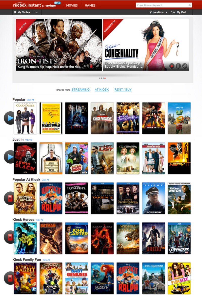
circa March, 2013
This is the screen I was greeted with when I visited redboxinstant.com (ca. March, 2013, now just redbox.com). With a quick scan, I saw there were some menu items, some featured movies, 3 grey buttons I’m not going to bother reading just yet, and then movies I can browse (not sure if that’s instant or kiosk or both yet). Then I saw there’s a search bar at the upper-right.
I scanned the carousel then below it to check out those 3 buttons since they looked important:
Subscription, At Kiosk, Rent / Buy.
Ok — so I can change my subscription features. Did I order a magazine? No, that’s probably the subscription to Redbox Instant. I can view what’s in the kiosks or I can rent and/or buy. Cool. But where do I see the streaming, instant movies?
I started scanning again — top-left corner:
“Redbox Instant” … hmm, okay. I didn’t accidentally go to redbox.com which is a totally different site altogether. This IS where the instant movies are. So that must be them there in the first row of browsable movies there. It must be the default.
I moused over Thor.
Yep. Big red ‘WATCH NOW’ button. These all seamed to be instant. Great. They got the defaults right. Thing is — why did I have to check? Why didn’t I just KNOW?
So I scrolled down to see what else they had.
Oh snap! They had Wreck-It Ralph, The Man With the Iron Fists, Taken 2, Flight and Dredd — all on instant! These had just dropped on DVD/Blu-Ray and were months from being released on Netflix. I thought
Props to Redbox — If they can keep up w/ releasing their streaming at the same time as their Kiosks Netflix has some serious catch-up to do! I’m gonna watch Taken 2.
So I hovered over Taken 2…
Wait — Blu-Ray? Must be a screenshot, I thought. Perhaps it means it’s a higher-quality stream ala Vudu’s HDX…
Hey — where did the Watch Now button go? I hovered over the rest — it was gone from all of them. Then I noticed the header, just above The Baytown Outlaws. Oooooh, Popular at Kiosk. Okay, so now I could see all of these were at the kiosk. Got it.
So initially, when I got to redboxinstant.com, I thought I was viewing streaming movies by default — otherwise, I’d have gone to redbox.com. So then I saw they’d started to merge their content — okay, I guess, eventually I suppose it’d all be merged at redbox.com. Fine. But right then, I wanted to watch an instant movie, got excited to see all the instant movies available, and ended up disappointed.
So in about 10 seconds, here’s the gamut of emotions I felt when I hit the home page:
Satisfaction (happy to have this service!)
Confusion (not sure what I’m looking at)
Understanding (I’m looking at instant movies)
Excitement (I’m gonna watch Taken 2 right now!)
Confusion (why can’t I watch it right now?)
Disappointment (oh — I’m viewing kiosk movies too)
Indifference (ah — I see they have trouble getting great streaming content quickly, just like Netflix)
Back to those 3 buttons…maybe there was something I missed. My stream of thoughts went something like this:
To their left I took the time to actually read the text I’d purposefully skipped earlier: “Browse More”. Browse More — Subscription. What the heck does that mean? I haven’t subscribed to anything, no magazines, no RSS feeds, no services…oh, redbox instant could be considered a service, is that what they mean by Subscription? If so, why isn’t it selected to show that I am, in fact, viewing instant, er, I mean subscription movies? I guess I’m viewing both, maybe? There is nothing to indicate what the list of movies I’m seeing is or where they can be found. I have to guess and check. My guessing and checking leads to understanding, excitement and ultimately confusion, disappointment and indifference. Now I have to click those 3 buttons to see exactly what they do. Oh — they take you to a set of pages that functions how I thought THIS page would function in the bloody first place.
Some very simple things can be done in about 15 minutes to save me, and thousands like me the 10 seconds of mental effort it took to get through all that and then generate a blog post:
Subscription? Really? Say Instant. Say Streaming. Say Online. Lots of other words to use. Subscription is just…wrong and means something else.
Indicate what the rows of movies below are.
Change the 3 buttons to something more indicative of page navigation links.
When you click on those buttons you actually navigate to another page entirely. The current style doesn’t make that very clear. So don’t make them look like a broken toggle/selected skin for an AJAX refresh, give me some other indicator that I’m viewing movies available for streaming AND at the kiosk.
Here are some simple ways we could address these issues:
I used the ‘Instant’ and ‘Kiosk’ icons already in use above in the featured movies (I didn’t even notice those until I started looking for how Redbox might have already differentiated instant from the kiosk). So they’ve already made the icons — just label each row what it’s full of and you’re good! This doesn’t affect the page size or layout at all and I think things are a lot clearer.
But even if you don’t do numbers 2 and 3, please Redbox, please, change the ‘Subscription’ to something that makes sense.
Arrr, Know Yer Personæ
If I were designing software for pirate captains who fight prehistoric sharks, my software would suck. Why? I don’t know enough about how they function and what options they have available to know what item(s) are most important to them in time of potential crisis.
Today the conversation at lunch inspired me to start writing a movie about a Megalodon that travels through time — that’s right, a time-traveling, prehistoric shark. Deal with it. Anyway, in the prologue, there’s a scene with a pirate captain. Oh yeah — it’s got pirates too. Sharks as big as Blue Whales: check. Time Travel: check. Pirates: check. I’m telling you — MEGA blockbuster. So, anyway, this pirate captain is carousing with his, um, cabin-mates, and he senses something is wrong. He grabs his [I have no idea what to put here] and heads up to the deck.
I have quite a bit of life experience. I’ve seen a LOT of movies. I’ve seen quite a few pirate movies. And, for the life of me, I have no idea what the pirate captain grabs when heading to the deck to see what’s wrong with his ship. Does he grab his sword? Does he grab his eyeglass? Does he grab his pants? A coat? I have no clue.
If I were designing software for pirate captains who fight prehistoric sharks, my software would suck. Why? I don’t know enough about how they function and what options they have available to know what item(s) are most important to them in time of potential crisis. I haven’t developed that persona enough to adequately comprehend and empathize with them in order to affect a design capable of responding to or, better yet, anticipating their needs.
If I’m designing a widget for a camping trip — and I make it so that widget requires constant access to wi-fi or cellular data I’ve probably failed. I’ve failed because I’ve not understood the personæ enough to know that they may not (and most likely will not) have access to wi-fi or even a cell signal whilst out and about.
If I’m designing an app for a nurse and it requires to be held with one hand and accessed with the other hand’s index finger, I may have failed. What if the nurse has to be doing task X with his left hand while using the app? Now all he has is his thumb — but I didn’t design it to be used with the thumb, so it’s awkward and slow and causes him to lose focus on his other duty — now Mr. Johnson’s catheter has to be reinserted, and we all know what a curmudgeon Mr. Johnson can be…
Knowing your persona can be a life-saver. I’m not saying you have to know how many kids Cindy has and their ages and favorite Power Puff Girls when designing the icon for the shopping cart button, but knowing that Cindy always has her Fred Meyer rewards card on her could be the difference between frustrating and delighting her. All I’m saying is — know your users/customers/clients what-have-you. Know them better than they know themselves, and you’ll know how to better serve them through your craft.
Now, time to get in the head of a pirate captain…what would he grab…maybe his spare leg? Rum? Lucky amulet? Time to do some ‘user’ research…(suggestions welcome).
The Billion Dollar Idea
I had a billion-dollar idea at lunch today: Mouse-over to buy. © ™ Patent-pending. Think about it — no more clicking needed!
I had a billion-dollar idea at lunch today: Mouse-over to buy. © ™ Patent-pending. Think about it — no more clicking needed!
Use-case:
Sarah visits Zappos.com (she’s already logged in from her last session — cookies FTW).
Sarah sees some shoes she likes and hovers over them to see the enlarged image.
BAM! Sarah just bought some shoes! Conversion without clicking! © ™
Sarah sees a featured dress off to the right…
BAM! Another sale before she’s even clicked the picture!
…2 days later…
Sarah gets an entire UPS truck dumped at her door and a bill for $55,324.69. (shipping was gratis, of course, Sarah moused over Amazon Prime at some point).
Zappos.com sees a spike of sales the first week dwarfing everything they’ve ever sold ever and goes down in the Guinness Book of World Records for the largest online sales numbers in history.
For some reason, this generates a TON of free press as well.
The end.
Really — that’s the end. No need to think about anything else after that.
The UX / UI Design Process
This is a basic rundown of the high-level concepts behind doing user experience research and design. State of the art for 2014, but largely still relevant today.
At its core UX is not a deliverable, but a business strategy and competitive advantage in the marketplace. — Troy Parke
Most of what I do isn’t actually making stuff. I’d say a large portion of my day is spent scratching my head, thinking, trying to match up users’ needs with viable interaction. I also attend a lot of meetings. And I talk to people. All the people; users, stakeholders, CEOs, developers, users, product owners, QA, doormen, literally…all the people. But, eventually, the people paying the bills want to see some deliverables. This post is a not-so-brief understatement of what UX designers generally do and some jargon in which we tend to do it.
For me, the core elements for the process are:
Stakeholder Interviews
User Interviews
Stories
Personæ
Scenarios
Mind Maps
Process Flows
Sketches
Interactive Wireframes/Prototypes
Style Tiles, Style Guide
Hi-Fidelity Comps
Stakeholder Interviews
This is where it all starts. The C-suite, product owners, architects, lead developers — anyone and everyone who has a stake in the success and desired outcomes of the project. What does the business expect to get out of this product? What are their goals, KPIs, rubrics? What does success look like to the CEO vs the CTO vs the Director of Training and Support? Understanding the undercurrents of the people that sign the checks and check the boxes is critical to the success of any UX effort.
As UX designers, we’re crucially and critically placed in a position to hold a lot of sway with the leads of every organization across the board. If we can build bridges and channels of communication between the disparate teams, we can empower our clients and ourselves to do truly meaningful, productive, and successful work.
User Interviews
When possible, getting feedback from actual users who actually use the current product (if there is one) or might potentially use the one we’re creating can be invaluable, hence user interviews. If you intend to build something, best get some input from the people you’re building it for. The actual users have more insight and clearer understandings of the problems they have than anyone else, including the designer. Getting their input can help us avoid going down paths that ultimately go nowhere and open up doors that we couldn’t see ourselves. That said, it’s important to weigh each user response carefully. As the (apocryphal) saying goes — if Henry Ford had asked people what they wanted, they would have asked for ‘faster horses.’ Sometimes the user doesn’t know what they really want or need, but they know their problems and issues, and even though they might not know the answer (which is the designer’s job anyway) they can help you find the right path that leads to it. Additionally, by observing them in their realm first-hand we can gain insights impossible to ascertain any other way.
Stories
When I take on a new project, it’s incredibly important to understand the stories behind it. Namely — what problems are we hoping to solve, what things are we trying to improve, who are we trying to help etc. These questions help set the stage for all of the work that follows. If the UX or UI don’t support the initial stories we defined at the outset, then we need to regroup and come up with ideas that do. The stories serve as an anchor to keep us grounded and focused on the overarching reasons we’re building the project in the first place.
Personæ
In order to effectively create a meaningful and useful solution we first need to understand and try to design what the end-user needs. One of the most effective ways to divine the user’s needs is to generate detailed and meaningful personæ. Where the stories help us focus on the problems and endgames, the personæ help us focus on the people who will actually use the product, without which the entire process is pointless and an exercise in futility. If stories are the anchors, the personæ are the rails along which we guide each decision, ensuring that the experience and interface are always focused on the user and helping them accomplish their goals with minimal cognitive friction.
Scenarios
Once we know what we’re building and for whom, we can create use-case scenarios that help us identify in more detail individual steps in the processes we’ll need to account for. The scenarios are the rough sketches that begin to define the workflows and experiences we hope to create for the user.
It’s really important to note here that the scenarios capture what the user is doing, but not how. Not yet anyway. Otherwise, you’ve stacked design effort onto yourself before you even understand the varied tasks people will need to perform.
Mind Maps
I love mind maps. Mind maps are my friend. They help me start to wrangle all the scattered thoughts and possibilities into a more cohesive pattern. Creating the mind map is the first step toward defining concrete design patterns, components, and detailed use-case scenarios. They’re easy to make, easy to update, easy to read, and incredibly effective at surfacing missing and redundant items and flows.
There are a ton of mind-mapping software solutions today. I like MindMeister and Miro at the moment.
Process Flows
With everything shaping up now, we can outline some process flows. Using UML-style diagraming we can map out how the user will proceed through the different steps and stages and reach their goal. The process flow can be one of the first real deliverables to stakeholders and other teammates. At this point, everyone has a chance to begin to catch the vision of how we’re attempting to solve the problem through improved usability and process. The flows help indicate how the user will progress and serve as a guide when creating the actual artwork.
Sketches
While almost never a client deliverable, sketching helps me begin to take the ethereal vision of the project and give it a corporeal shape. Until now, we’ve been primarily concerned with high-level “Whys?” and “What ifs?” Now we start to pave the road that leads to the actual software.
Interactive Wireframes
Now that we know what we want the user to do and when we can sketch some wireframes to begin architecting the visual interface. The wireframes will serve as the skeleton of the interface. They are easy to make and update and can even be used in additional user surveys in a process called ‘paper prototyping’. Wireframes can also serve as a scaffold to help the engineering team begin to formulate plans and designs of their own. This can be another checkpoint where stakeholders can review progress and see the product begin to take form and function and come to life.
What makes a wireframe interactive? Simple: by wiring up a wireframe (or even bits of paper) so I can advance down a path in a way emulating how the actual software might work — it’s now interactive. It can be as simple as shuffling pieces of paper, adding hotspots to images in Keynote, or using powerful tools such as InVision (2020 EDIT: I now use Figma almost exclusively). Better yet — I love to wireframe in the browser using frameworks like Foundation and Bootstrap. That way you’re that much closer to reality. Regardless, the sooner you can introduce interaction into your designs, the better. Period.
Building the prototype forces you through the actual steps of building something that works (at least to some degree) as the intended final product. Building a prototype will shed light on problems and nuances in the product that were impossible to foresee otherwise. It can also validate decisions made, or showcase in painful glory any mistakes. Fortunately, it’s still not too late and early enough in the game that you can regroup and iterate over any lessons learned in the prototype phase.
Style Tiles / Style Guide
Style Tiles are useful little tools that help you start to play with the final look and feel of an application without spending hours mocking things up over and over again. Designers love them because of how rapidly they can be produced. Clients love them because it gives them an easy way to quickly grok different stylistic visions for a project.
Once the vision is decided upon, creating a style guide can be incredibly useful to ensure that exactly what you designed gets implemented. It also lays the foundation for additional work in the future. Having a living style guide can help ensure predictability and consistency throughout a product as it grows. It also provides the perfect reference for the engineer so there’s never any question as to exactly how they should implement the design.
Another incredibly useful way to work here is leveraging Brad Frost’s Atomic Design principles, style guide resources, and dynamic site generators like PatternLab.io. Anything that gets you finished product faster that’s more maintainable, buildable, and extensible is a huge win IMHO.
Hi-Fi Comps
Once you’ve iterated through the process, wireframes, and styles you should have enough information that engineers can begin building the foundations and supporting controls and interfaces. If needed, you can get to the pixel-pushing — the creation of high-fidelity comps. The hi-fi comps are the actual look/feel that will be visible in the final product. Although possibly the least important in terms of user experience, the UI is the most visible aspect of the entire product and the #1 factor in garnering trust in your users. Regardless of how awesome the workflows and usability are, if the end-product is ugly, few will want, use or buy it. This is the eye candy and where we can put the real polish and shine on all the hard work we’ve done so far.
Hi-Fi Comps are also the most expensive part of the process and should be minimized (or eliminated) if at all possible. In a world where your software or website can be viewed on any one of thousands of devices and screens, it’s literally impossible to cover every single possibility. This is why style tiles and guides are so important. By wireframing in the browser using responsive frameworks and relying on consistent styling, you’ve positioned yourself to be able to handle any device that comes your way without having to mock up thousands of views for every single page.
So — this is my process in a nutshell. I don’t always completely execute every step for every product. That’s not to say that I skip any of these steps — but sometimes they can be internalized rather than run through in full, real-world glory. I think each product requires a slightly different approach. Agile development environments and tight schedules may also limit how much time we can spend on each process — so internalizing some so we can spend more time on other, more critical steps can be vital — because in the end, shipping the product is the most important feature we will ever implement.
Did I miss something you love? Do you violently disagree? Please let me know by responding!


