Client
Porte (Populous)
Populous's first mobile-only bank had to stand out in a saturated market, for a generation it had never designed for. We researched and tested every layer, from app to card to mailer to brand, before a line of code was written, and shipped a 1.0 that earned 4.8 stars.
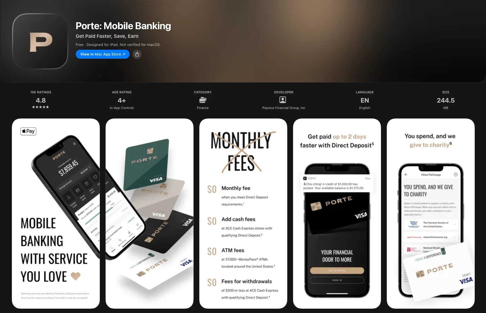
Porte's parent, Populous, had been in financial services for more than fifty years. In all that time it had never built anything for the way younger people actually bank: classy, elite, mobile-first, on their own terms.
Porte was the answer: a mobile-only bank built for the underbanked and aimed squarely at college students. Nobody wanted a copy of the old bank. The goal was the account those students wished existed: one that helped them understand and grow their money, instead of just holding it.
The brief was a hard one. Launch a brand-new mobile bank into a market already full of polished apps, and give a generation that had never been Populous's customer a reason to choose it.
Every neobank and legacy player already had a mobile app, most of them competent. A merely adequate Porte would have been invisible. It had to give people a reason to switch.
And it was being built by a company with deep banking experience but no track record designing for this customer. The pull to ship a thin first version and iterate later was strong. In a crowded market, that's fatal.
We didn't need another banking app. We needed the bank we all wished we'd had.
So the job was to launch a fifty-year-old institution's first mobile-only bank into a crowded market, and give a generation it had never served a reason to pick it over apps they already trusted.
The obvious path was to design from the team's vast and tried instincts and benchmark against the category leaders. We did the opposite. Before committing to a direction, we went to the customer: on-premise intercept interviews about how they bank, what they value, and what they want from their money.
Then we tested relentlessly, at every layer. We signed up for every major mobile bank and ran real banking tasks through each to find where they shined and where they failed. We ran information-architecture studies to shape the flows, usability rounds on low-fidelity prototypes, and — before a single line of code — repeated studies against the high-fidelity prototype with real customers, on-site and remote, to settle IA, UX, UI, accessibility, and usability up front.
The research worked so well the engagement grew: we went on to design and test the card itself, the mailer and unboxing, the brand, the teaser films, the marketing site, and the copy. By the end, every member of the team felt they knew the customer personally: designer, PM, developer.
We researched and designed the entire Porte experience, end to end. Here are three pieces of it.
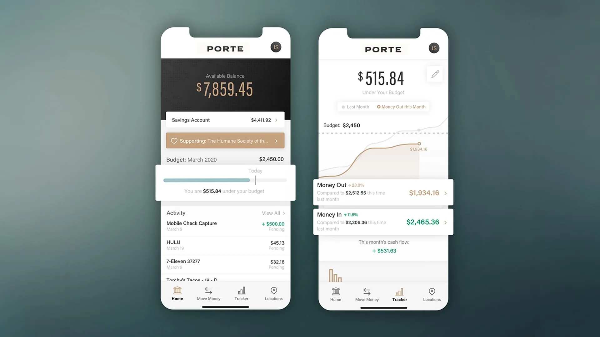
The product real customers tested before any code: a home that surfaces savings, the charity you support, and how far under budget you are at a glance, and a spending Tracker that turns money in, money out, and monthly cash flow into something you actually understand.
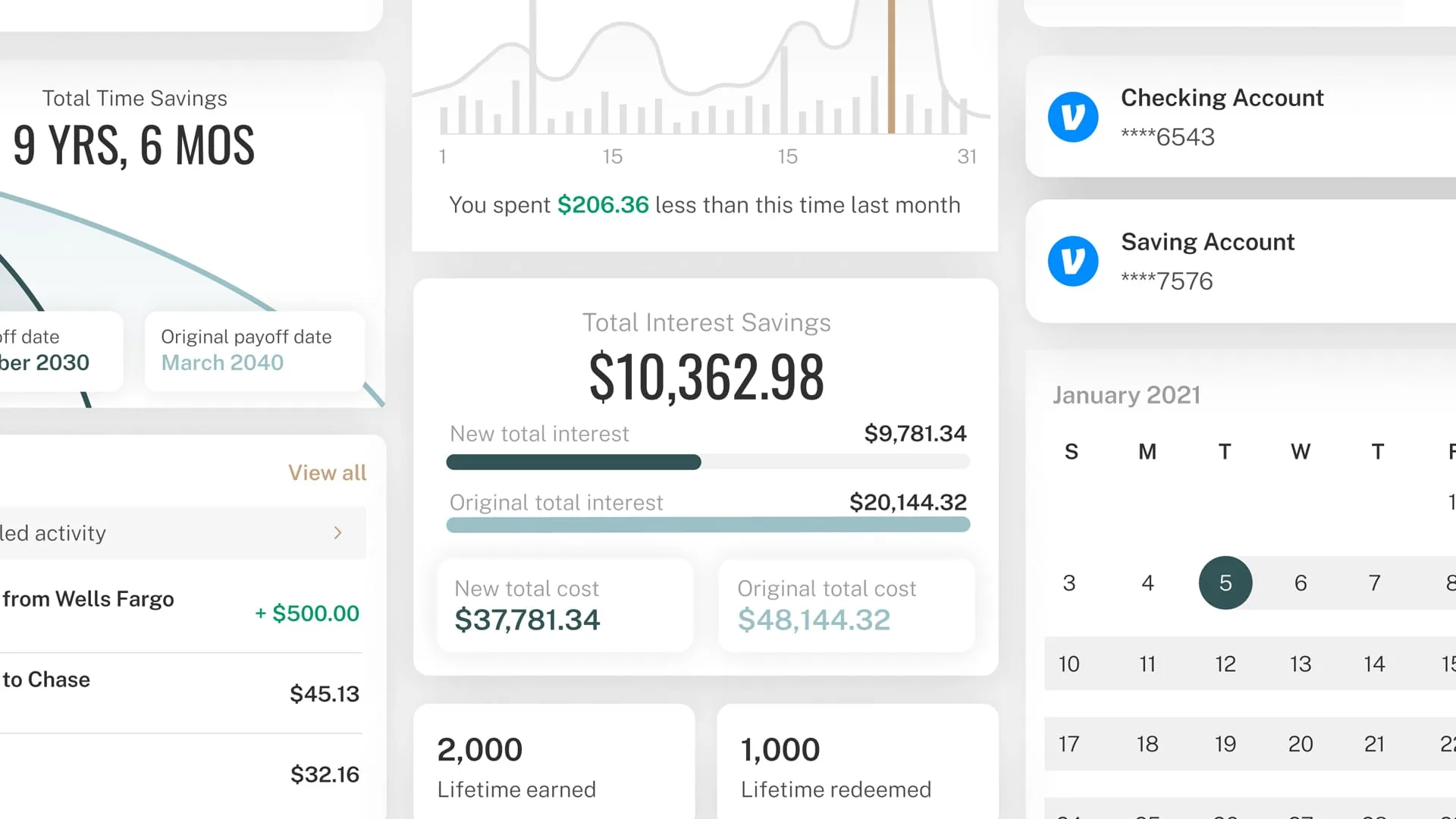
Up close, the depth behind the dashboard: debt-payoff projections that count the years and interest you'd save, spending broken down by category, linked outside accounts, a payments calendar, and rewards earned on what you already buy.
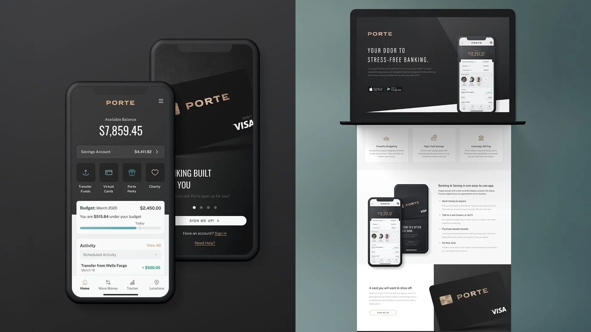
The identity that tied it together: the black-and-gold Porte card, the onboarding, and the marketing site, each researched and tested for imagery, tone, and message so the whole funnel spoke with one voice.
We designed more than a first release could carry. Several of the most ambitious features were genuinely hard to build and didn't make 1.0. Many still sit in the backlog years later. But they were researched and designed, so the roadmap was drawn long before the engineering caught up.
What I'd do differently: we trusted third-party vendors who swore their micro-apps and APIs would be ready by ship date. They weren't. When the devs went to build what we'd designed, the tools couldn't support it and offered no APIs to hook into, so 1.0 shipped with their clunky embedded micro-apps bolted in, unstyleable, unable to match Porte's aesthetic and quality. The result was a Frankensteined first version that compromised the very UX and UI we'd tested so hard to get right. The vendors fixed it eventually, and Porte looks great today. But I'd never again design against a capability a vendor only promises to have later.
What surprised me: how low the bar actually is. It is not hard to build a banking app that looks and feels the way people want, and yet so many feel two decades old. The reason, I learned, is rarely the design team; it's the archaic internal systems and third-party micro-apps banks are forced to build on. Even in 2019, making something modern out of that legacy plumbing was like pulling teeth. The design was the easy part. The plumbing underneath was the fight.
What I took with me: this was the project where we stopped saying "MVP." Minimum viability doesn't make a good product. We shipped a minimum lovable product instead, a "cupcake": small in scope but complete across every layer, with enough great UX, reliability, and polish to be genuinely loved at 1.0. We've run on the cupcake, birthday-cake, wedding-cake model ever since. Ship something small, whole, and lovable.